


2.5 x 3.5 Interface Design...With Attitude Please
The past 6 or 8 years that I've spent in the web design and interactive world have definately taught me the importance of funtionality and interface design, things that typically aren't at the top of your priority list when creating magazine ads or TV spots. I mean when was the last time you had to interact with a TV commercial or navigate through a tri-fold brochure.
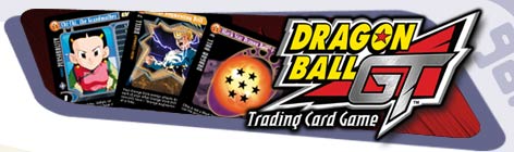
But, when I was asked to create several designs for the Dragon Ball GT Trading Card Game, the worlds of style and functionality had to be merged. I wasn't just designing a 2.5" x 3.5" piece of art, the design and all the required elements on the card had to combine to make the game easy to play, not just look good under glass.
As the old saying goes, "Form follows function.". But I promise you, function alone rarely sells in retail stores. Both were required, and both had to fit within the confines of a playing card.
What Do the Cards Have to Do?
Any card game has it's required elements. For standard playing cards it would be the hearts, diamonds, clubs, numbers, and even the black and red color. Each of these elements holds important information which affects the game.
For the Dragon Ball GT card game things got a little more complex, there were between 13 - 17 required elements that had to be arranged on one side of the card. They had to be grouped in a way that made logic sense, with many things relating to other elements on the card, AND they had to be placed where the information was easy to review quickly while playing the game. Nobody wants to play a card game that makes you fumble through each card before you can determine whether or not it's a good card to play.
And if fitting 17 unique design elements and information on a little card wasn't enough, there still had to be room for the "featured art" (or screenshot).
Why don't you go ahead an try this little exercise with me at home. Cut out a 2.5" x 3.5" piece of paper. Now from another sheet of paper, cut out 5 squares, 5 circles, 4 Triangles and 3 diamonds each about 1/8" to 1/4" in diameter. Now lay out your little shapes on the card to that all the squares are together, all the circles are together, all the triangles are together and all the diamonds are together....and leave room somewhere for a 2" x 1.75" square (for our featured image).
Don't forget that all the squares and circles have to be viewable when the card is held in a fan, (as if you were holding several cards in a poker hand).
Do this successfully and you'll BEGIN to understand the problems ahead.
Sound challenging enough yet? Well, we're just getting started.